The reason that this double page spread inspires me is because of the boxes around the text. I like this idea because it makes the text stand out more and makes the reader more attracted to it. I am also inspired by this because they use alternate coloured text so it makes the reader feel as if that he is not reading a hold lot of text.
The reason why this double page spread inspires me is because of the way in which they have used the image to contrast the two pages.
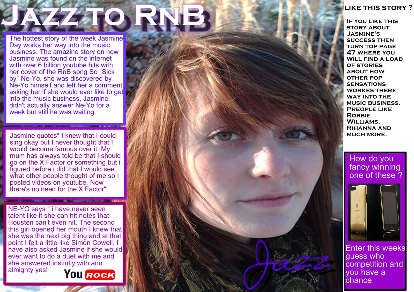
This is my double page spread
I have put my text into text boxes like the first DPS
and also made the image go over the two pages to contrast the pages together like the other DPS.
Tuesday, 4 January 2011
Thursday, 16 December 2010
evaluation (questionnaire)
during today's lesson i did a questionnaire to other pupils in the school. I decided to go for the year 11 as they are the right age for my target audience the questions that i asked were
for question 1 all 5 said yes it does
for question 2 4 people said colour and 1 person said image
they said the change that they would make to the colour is not make it purple and make it stand out more.
the person that said the image they said that it look too edited and picture is a bit blur.
- would the image that i used in the magazine attract you into buying it?
- if you were to change anything on the magazine what would it be? layout, font, colours or image
- to the ticked aspect above how would you change it?
for question 1 all 5 said yes it does
for question 2 4 people said colour and 1 person said image
they said the change that they would make to the colour is not make it purple and make it stand out more.
the person that said the image they said that it look too edited and picture is a bit blur.
Wednesday, 15 December 2010
DPS final
This is my final draft of my DPS the changes that i have made is a few minor spelling mistakes. I have also added a glow on the masthead to make it stand out more.
corrections- improvements
During today's lesson i asked my class mates what they thought of my double page spread so i printed out a copy and wrote down there comments the feedback that i got was
Make the masthead stand out a little bit more because it blends in too much with the background
Also there where a few minor spelling mistakes and punctuation mistakes so during my next lesson i will be making them improvements and posting another draft of my DPS.
Make the masthead stand out a little bit more because it blends in too much with the background
Also there where a few minor spelling mistakes and punctuation mistakes so during my next lesson i will be making them improvements and posting another draft of my DPS.
Tuesday, 14 December 2010
Double page spread draft 3
This is my 3rd draft of my double page spread the changes that i have made are just some small corrections like spelling mistakes. I have also added another text box to keep the reader interested because they will read on if all of the information has been broken up rather than in one whole piece.
Thursday, 9 December 2010
Music Magazine double page spread draft 2
This is the second draft of my double page spread the changes that i have made is i have put a little side story on there to keep the readers a little more interested in the story i have also moved things around to see if things look better. I have also changed the image to a close up and have used the whole image as the double page to contrast the two pages together.
Tuesday, 7 December 2010
Music Magazine double page spread draft 1
During today's 2 lessons i made my first draft for my double page spread. i have had comments that it is good how the page has been separated with the playing cards but it could be better if the main image was to bring the two pages together. Also my peers said that they should be playing cards because it doesn't really fit in with anything.
Subscribe to:
Posts (Atom)