Tuesday 4 January 2011

Front cover inspiration

The reason in which that i am inspired by this front cover is because of the image that has been used as it is similar to the one in which i have used. also it inspires me becauase they have used just three colours in there colour scheme which also is what i have decided to do. This is the image that i used to compare. Although this is not a music magazine it still fits in with the traget audience which is teenage girls.
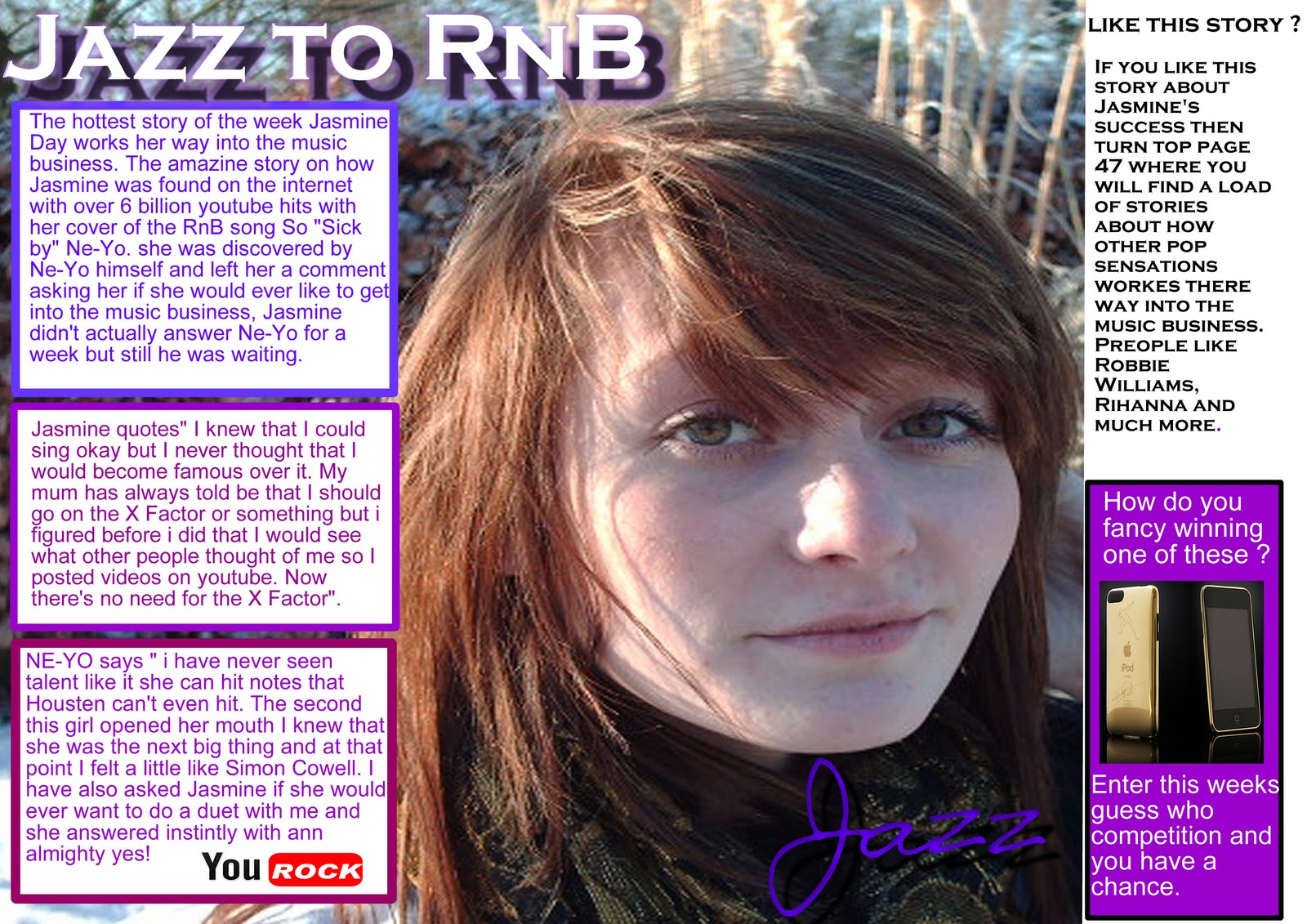
This is the image that i have used

Contents page inspiration

The reason why this contents page inspires me is because the background fades from dark to light. I like the idea of this because it looks very professional yet unconventional.
The reason why this contents page inspires me is because they have used different coloured font when listing the stories inside. I like the idea if this because at attracts the reader into looking at the stories because it is not just block information.

This is my contents page
I have used fading from left to right and used different coloured text to separate the writing

DPS Inspiration

The reason that this double page spread inspires me is because of the boxes around the text. I like this idea because it makes the text stand out more and makes the reader more attracted to it. I am also inspired by this because they use alternate coloured text so it makes the reader feel as if that he is not reading a hold lot of text.


The reason why this double page spread inspires me is because of the way in which they have used the image to contrast the two pages.


This is my double page spread

I have put my text into text boxes like the first DPS
and also made the image go over the two pages to contrast the pages together like the other DPS.